
Choosing colours for stitching

Choosing the colours for my embroidery is probably my favourite part of the preparation process but it can sometimes feel a little intimidating. I am a wearer of neutral colours, blacks, greys and browns are my colours of choice but when I make things, whether it’s knitting, painting or stitching I love to use a bit of colour. It’s a shame to be afraid of colour so I thought I would share a few little tricks you can use if you are not very confident about colour.
The first thing is to start noticing colours, not just a single colour in a scene or image but the way in which all the colours are working together. When you are out and about snap pictures of areas of colour that catch your eye. Kaffe Fassett loves to take pictures of old walls to capture all the different colours in the brickwork. Normally I would say galleries, museums and gardens are fabulous places for looking at colour but here in the UK we can’t do any of that for real at the moment. However we are lucky enough to have the internet world and museums like the V and A or galleries like The Tate or National Gallery all have online collections for you to look at. And then, of course, there is pinterest… you can travel the world with pinterest without leaving home! Piles of spices in India for rich and beautiful colours or faded Persian miniatures for soft subtle colours. Another fun site to mess around with colour palettes is design seeds you can put in a search or just look at their colour palettes for the season. The site shows a picture then breaks the picture down into a colour palette. Always fun!
If it’s something you see when you are out and about take a picture of it or take a note of the colours and get some coloured pencils out when you get home to quickly jot the colours down. If it’s on pinterest then pin it, but take some time to look at the colours and how they work together. What is the background colour? How much of each colour is there?
It’s important to notice how much of each colour is in the image. There might be a beautiful tiny splash of ochre in the midst of lots of pinks, when you want to use the palette in your stitching you want to make sure that you are only using a splash of ochre and lots of pinks. That’s not to say you can’t experiment with switching the amounts around though.


I have quite a few second hand Persian, Indian and Japanese art books that I love to use for colour ideas but there are also objects around the house, like my sewing tin, that you probably chose for their colours. All of these are great sources of colour palettes. You could even keep a special colour notebook where you keep swatches of colour (pencil crayons or paints or even thread taped in) to remind you of a colour palette you want to try.
And then there is fabric. Obviously liberty fabrics are my absolute favourites here. The second to last picture is possibly my favourite liberty fabric ever, I’m not even sure if I can still buy it so I hang onto this scrap for the colours. If you are making one of my lavender girls or fairies with attitude then I recommend using the print fabric that you choose as a guide for the colours for socks and hats.

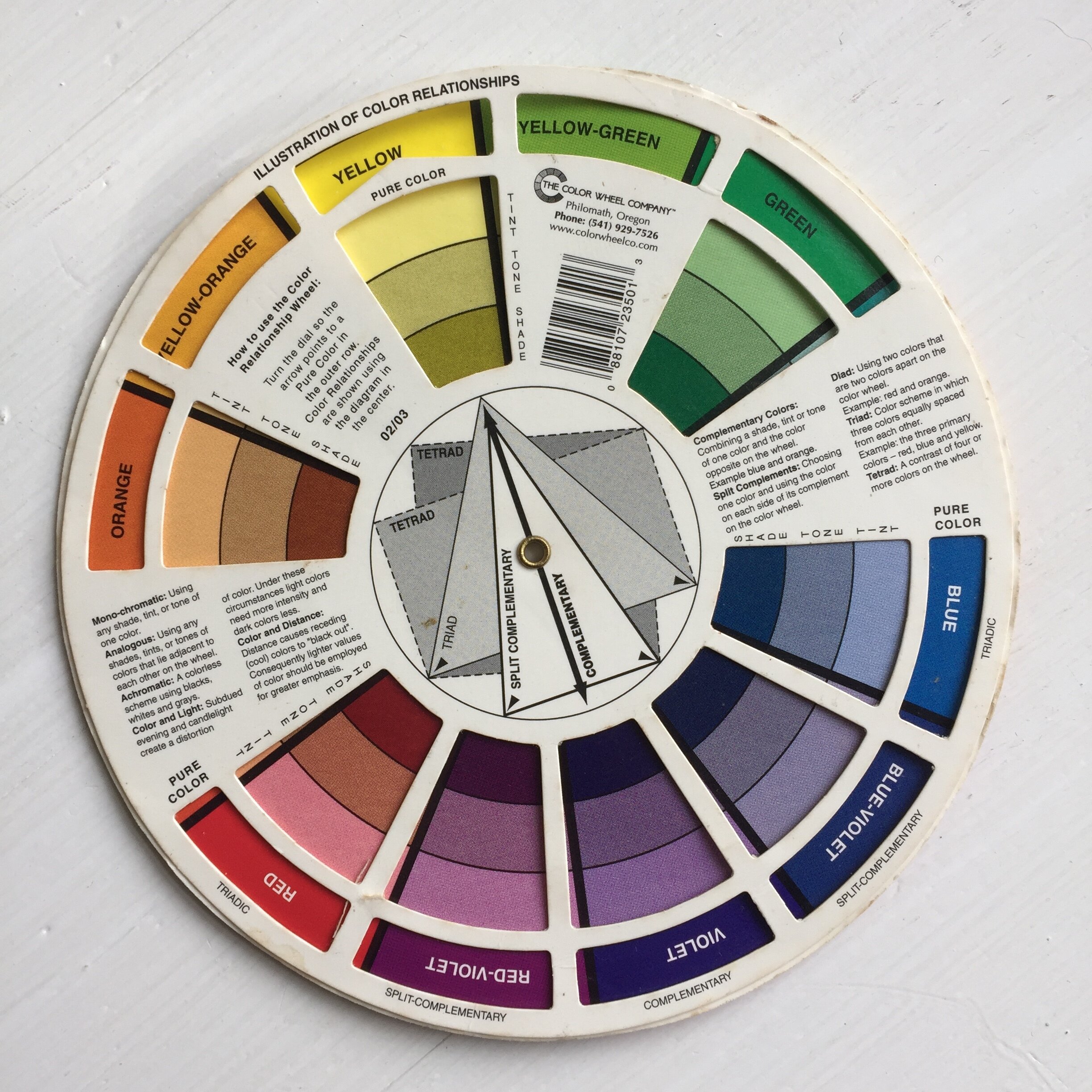


If you want to take your colour more seriously then I recommend ‘Colour Confident Stitching’ by Karen Barbe This goes into a lot of detail about choosing colour palettes, showing you ways of working out the proportions of colours and talking about using complementary colours and harmonious colours. It’s not so much a project book but it’s presented in a lively way and not a dry book at all. And of course you can get yourself a colour wheel. I bought mine in a quilting shop but this one looks the same. I love messing around with this for painting as well as choosing stitch palettes. At it’s simplest the colours on either side will harmonize well with your chosen colour and the colour opposite (complementary) will also work well.
Finally you can always use the free sampler design to test out your colour choices, filling areas of colour with satin stitch, split stitch, seed stitch or french knots. You could even applique some of the shapes with plain coloured fabrics and stitch on top of them. It’s important to remember that if you don’t like a particular colour once it’s stitched you can easily remove it with your trusty seam ripper and no-one else ever needs to know it was there! I apply this rule to quite a lot of my experimental crafting and drawing.
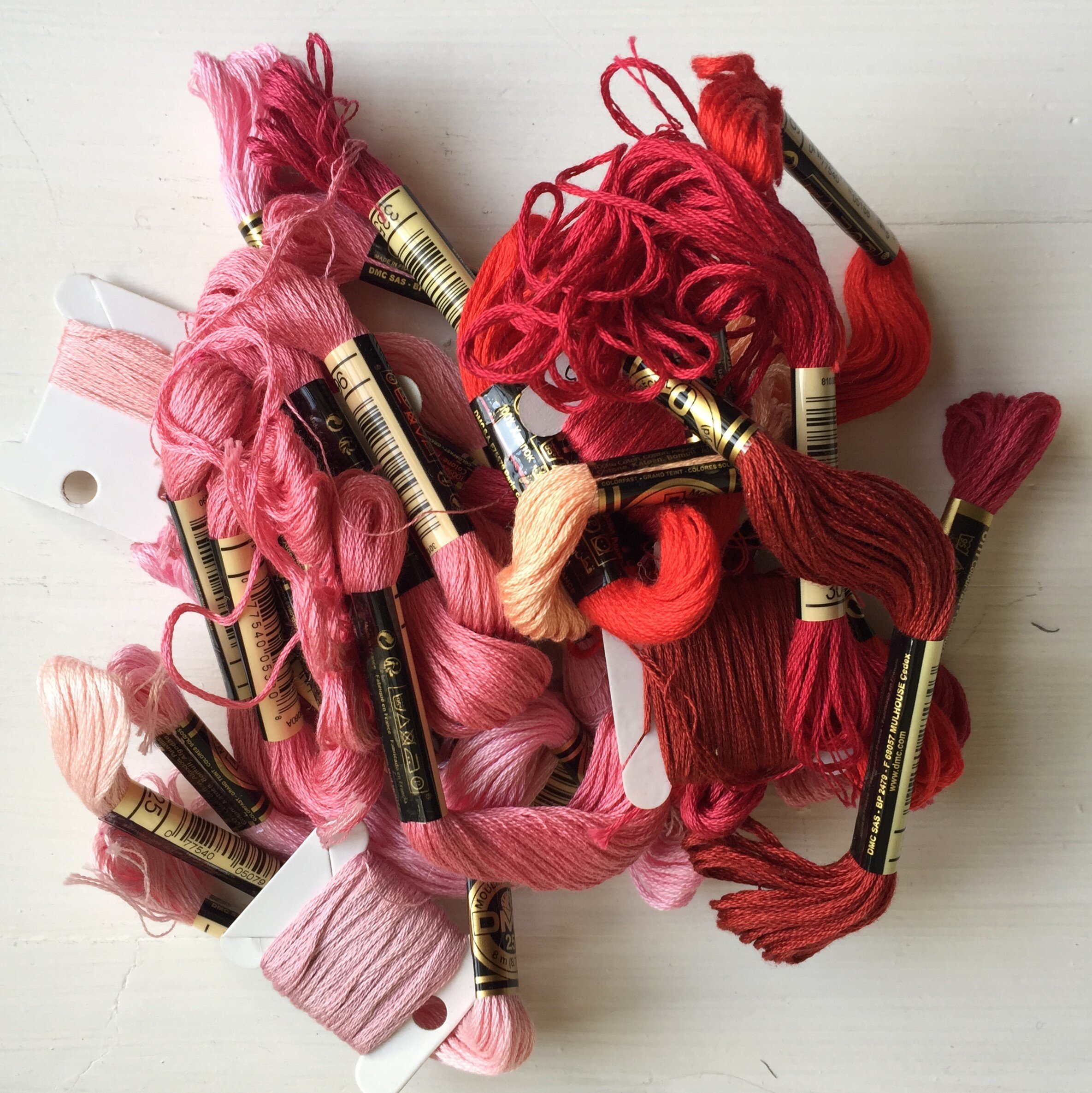
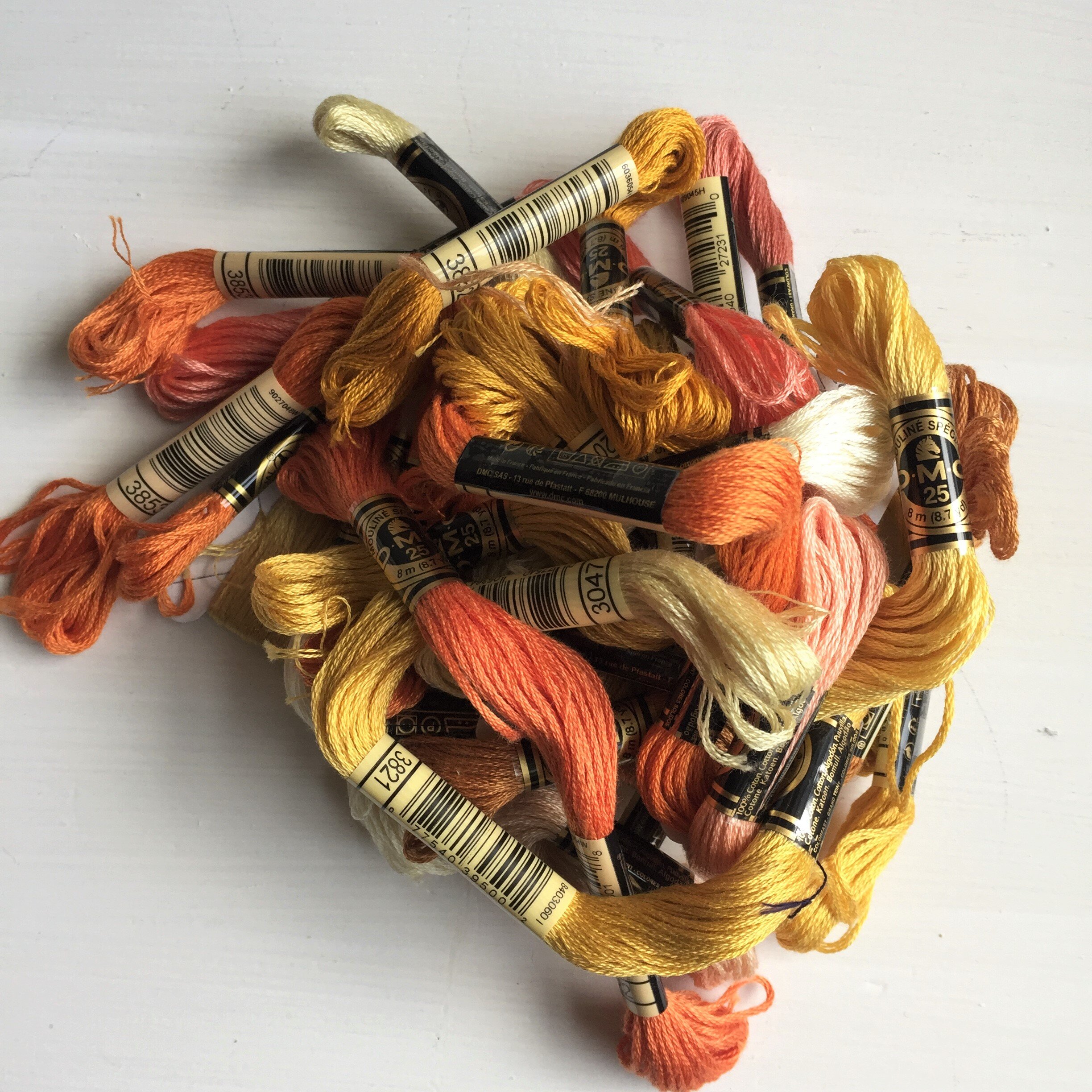
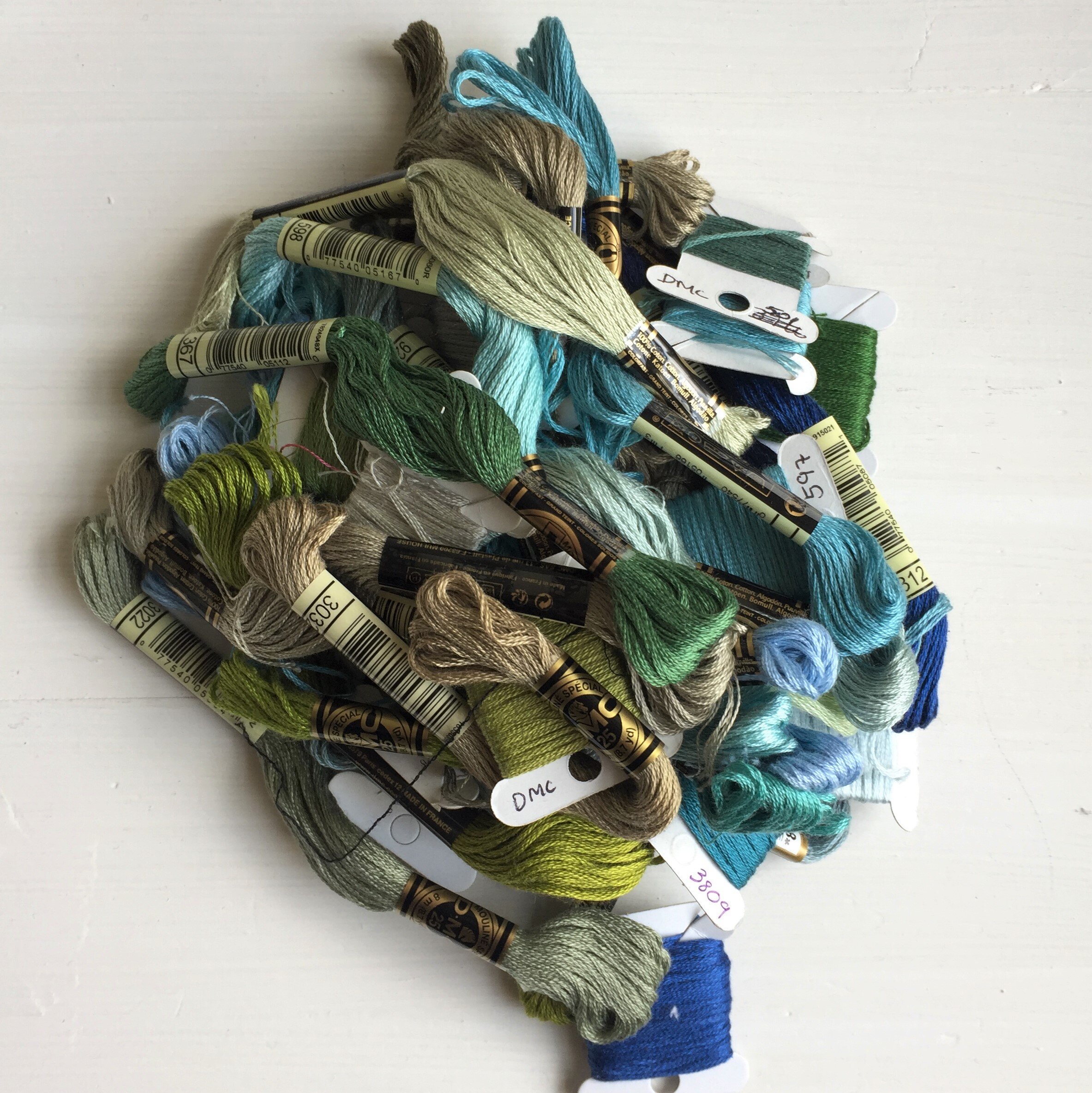
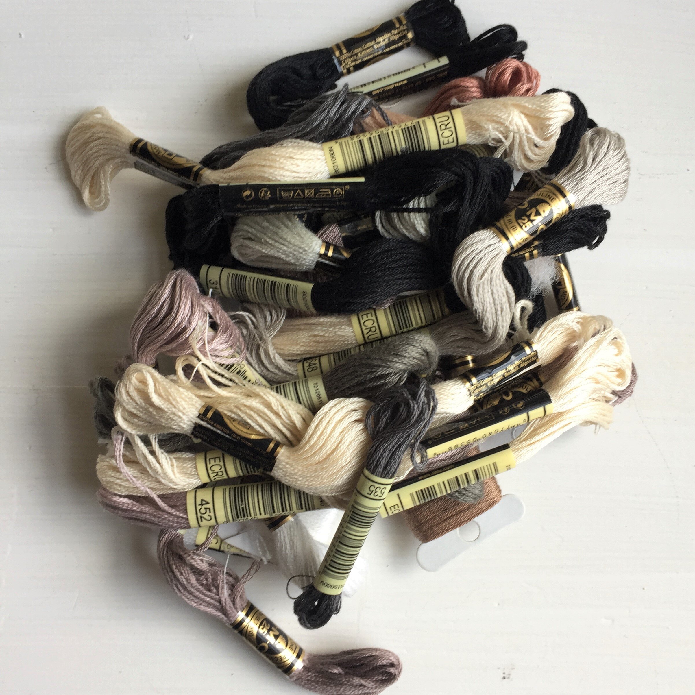
Ordinarily I love to take a trip into Truro and browse the embroidery threads in Truro fabrics and choose them in the flesh but sadly that’s not possible right now in lock down so I have a DMC shade card to help me order online. This is a little bit of an outlay if you are an occasional embroiderer but I thought I would mention its existence as I only realised they existed about a year ago and it’s really useful for ordering thread online.
I hope you have fun playing with colour either out and about on your daily walk or online on pinterest and design seeds.